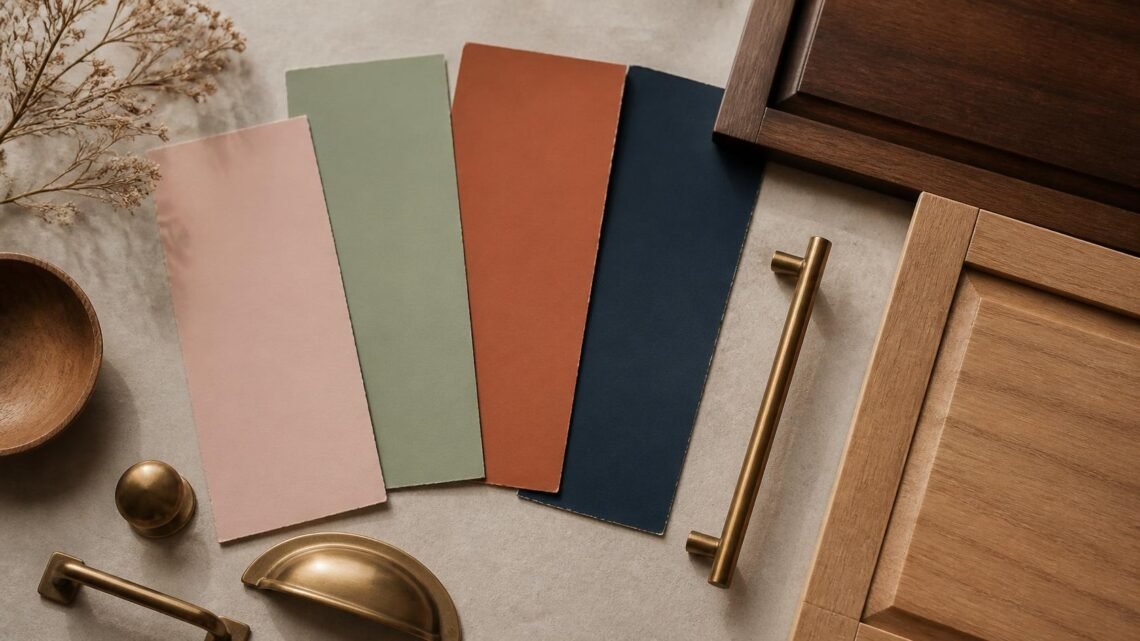
Vintage-inspired color schemes have a warmth that a lot of modern, high-contrast palettes lack. They’re built from muted, slightly dusty tones rather than saturated ones, which is part of why they read as timeless instead of trendy. Here are ten palettes worth pulling from, along with the wood tones and finishes that pair best with each.
1. Dusty Rose and Cream
Soft, romantic, and surprisingly versatile. Pairs beautifully with warm walnut or cherry wood tones and brass hardware.
2. Sage Green and Ivory
Calming and a little farmhouse-adjacent without tipping into cliché. Works well with light oak or whitewashed wood finishes.
3. Mustard and Charcoal
A bolder, mid-century-leaning combination. Best with dark walnut or espresso-finished furniture and matte black hardware.
4. Terracotta and Cream
Warm and earthy, with a slightly Mediterranean feel. Pairs well with natural rattan, light woods, and brass accents.
5. Navy and Brass
Classic, a little formal, and dependable across almost any room. Works with darker woods — mahogany or espresso — and warm metal hardware.
6. Dusty Blue and White
Soft and cottage-adjacent, especially in bedrooms. Pairs well with painted white or light natural wood furniture.
7. Blush and Sage
An unexpected but genuinely beautiful combination for bedrooms and nurseries. Works with light woods and soft brass or gold accents.
8. Olive and Rust
Earthy and warm, well suited to boho or collected-vintage interiors. Pairs with medium to dark wood tones and black or bronze hardware.
9. Cream and Walnut
A quieter, more neutral palette that lets furniture silhouette do the visual work. Naturally suited to walnut furniture, obviously, but also pairs well with cane and rattan details.
10. Plum and Gold
Rich and a little dramatic — best used in smaller doses, like an accent wall or upholstery, rather than across an entire room. Pairs beautifully with dark wood and warm gold hardware.
How to Choose a Palette for Your Space
Look at the wood tones you already own before picking a new palette. A room full of warm walnut furniture will clash with a cool, blue-heavy scheme, while the same room will feel effortless next to rust, mustard, or cream.
Where to Use Color vs. Where to Keep It Neutral
Vintage palettes tend to work best when the color lives in textiles, walls, or smaller accent pieces, while the larger furniture pieces stay in neutral wood tones. This keeps the room from feeling dated the way an entirely color-matched vintage room can.
What to Buy First
If you’re building a room around one of these palettes, start with your largest furniture piece in a neutral wood tone, then choose your wall color, then layer in textiles and accents in the accent shade. Committing to color on paint or fabric first, before furniture, often leads to a mismatch down the line.
Where to Spend vs. Where to Save
Spend on furniture in a genuine wood finish — it holds color and undertone far better over time than a painted or laminate piece. Save on paint and textiles, which are the easiest and cheapest elements to change if you want to shift your palette later.
Palettes That Age Well
The vintage palettes that last are the muted ones — dusty rather than bright, warm rather than stark. If you’re choosing between two options and unsure which will hold up over years rather than a single season, the softer, more muted version is almost always the safer bet.