Dark furniture has a way of looking either intentional and rich or heavy and dated, and the wall color around it is almost always what tips the balance. The right backdrop can make a dark dresser or bed frame look considerably more expensive than it is. The wrong one makes the same piece look like it’s dragging the whole room down.
Warm White Instead of Stark White
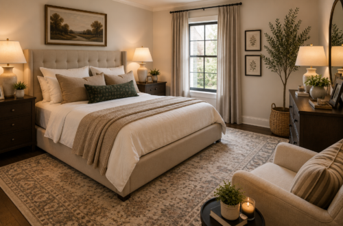
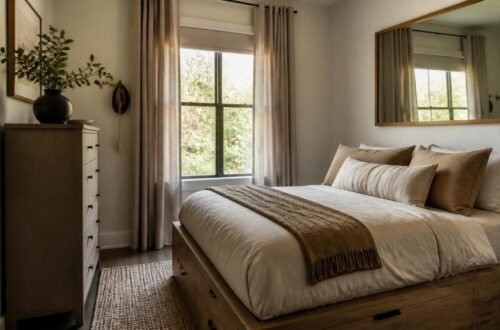
A crisp, cool white can make dark wood tones look harsh by contrast. A warm, slightly creamy white softens that contrast and lets the wood’s undertones read as rich rather than heavy.
Deep Green
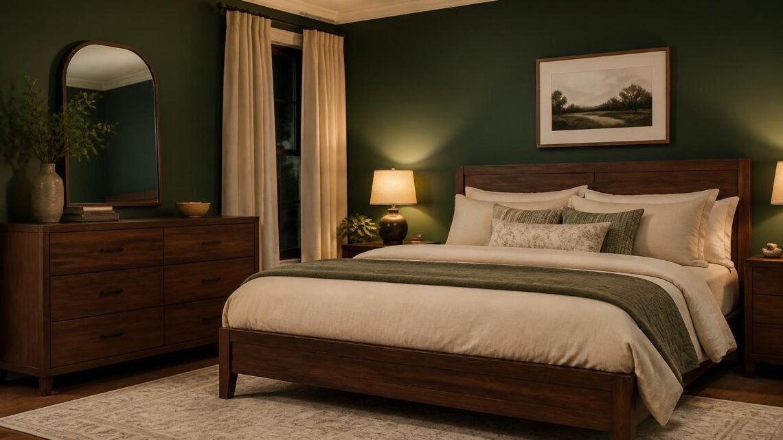
A muted, deep green — think forest or olive rather than bright emerald — creates a sophisticated, almost jewel-box effect against dark walnut or espresso furniture. This pairing photographs especially well in evening or lamp lighting.
Dusty Blue
A soft, grayed-out blue keeps a room feeling calm while still providing enough contrast for dark furniture to stand out rather than disappear. It’s one of the more versatile options on this list.
Terracotta or Warm Clay
Earthy, warm tones bring out the red and orange undertones in cherry or mahogany furniture, creating a cohesive, intentional-looking pairing rather than a clash.
Soft Blush
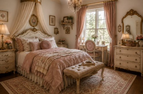
An unexpected but genuinely effective pairing — a muted blush wall softens the visual heaviness of dark furniture and adds warmth without competing with the wood tone.
Charcoal or Deep Gray
For a bolder, more dramatic bedroom, a deep charcoal wall lets dark furniture blend intentionally into a moodier palette rather than standing in contrast to it. Balance this pairing with lighter bedding and metallic accents so the room doesn’t feel too heavy overall.
Sage or Muted Olive
A calmer, more neutral green than the deep jewel-tone option above, sage works particularly well with lighter dark woods, like a medium walnut, rather than very dark espresso tones.
Getting the Contrast Ratio Right
As a general rule, the wall color should be either notably lighter or notably darker than your furniture, not close to the same value. A wall color too similar in tone to your furniture tends to flatten the whole room rather than creating the rich contrast dark furniture is capable of.
What to Test Before Committing
Paint a large sample swatch and view it beside your actual furniture at different times of day — the same color can shift dramatically under morning light versus lamp light in the evening. This matters even more with darker, more saturated wall colors.
What to Buy First
Start with paint samples in two or three of the palettes above, tested directly against your furniture, before purchasing full cans. Bedding and accent decor should come after the wall color is finalized, not before.
Where to Spend vs. Where to Save
Spend on quality paint with good pigment saturation, especially for deeper colors like charcoal or forest green, which can look chalky or uneven in cheaper formulations. Save on bedding and accent pieces, which are easy to swap once the wall color is settled.
Letting Dark Furniture Do What It Does Best
Dark wood furniture has real presence, and the right wall color lets that presence read as intentional and elevated rather than heavy. Choose contrast over similarity, test before committing, and let the furniture be the anchor the wall color is designed to support.